
Keeping Animated Learning Videos Coherent Without Losing the Cool Factor
Ever watched a learning video with gorgeous, dynamic graphics and animation, only to realize once it's over that you can't actually remember the main points?

Why the Coherence Principle Matters in Multimedia Learning
Ever watched a learning video with gorgeous, dynamic graphics and animation, only to realize once it's over that you can't actually remember the main points?
Chances are, a video like that prioritized aesthetics without tying them back to the learning context. The result: the key messages get drowned out.
In an increasingly competitive digital learning landscape, aesthetics do matter, but they shouldn't come at the expense of coherence. That's especially true in the corporate world, where training isn't just entertainment — it needs to deliver a real impact on employee performance.
According to Richard E. Mayer, a major figure in multimedia learning, there's a concept called the Coherence Principle. It holds that learning is more effective when all the visual, text, and audio elements in a video actually connect — that is, they work together to reinforce the material being delivered.
In other words, the voice-over or presenter, graphics, text, and animation aren't just decoration. Every element has to be chosen and designed with real thought behind it, in service of the learning process. Too much ornamentation, or irrelevant information, can easily pull participants' attention away from the core material.
The Role of Storyboarding in Balancing These Two Elements
At Monkey Melody, we believe that cool and coherent aren't opposites. In fact, the two can go hand in hand, as long as they're designed together from the start.
One of the key levers here is the storyboarding stage. Before any animation work begins, our team converts the source material into a script. That script is then turned into a visual storyboard.
A storyboard itself is a sequence of images or sketches that maps out a video's visual flow and narrative, serving as a guide for designers and animators. Its elements include scene sequencing, the placement of visual assets, the selection or sketching of those assets, animation direction, and so on.
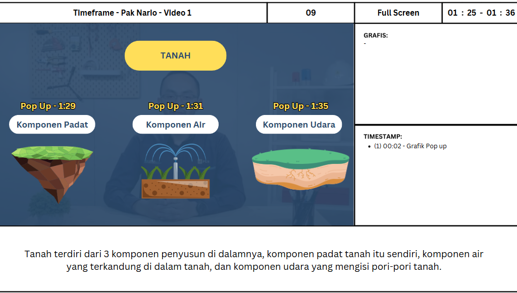
During this phase, our team dissects the content and carries out enough research to make sure every visual asset carries the right context for what's being communicated.
Our storyboard team also works out the layout, as well as the timing of when and how each visual element appears and moves, so it stays aligned with the narration. These elements ultimately produce animation that's both engaging and accurate in terms of content.
In post-production, designers and animators then have a clear guide for turning that storyboard into a final visual product that's engaging, yet still relevant and easy for learners to digest.
We also check in regularly with Subject Matter Experts (SMEs) whenever needed, to make sure the visuals we create are not just aesthetically pleasing, but technically and pedagogically accurate as well.
Of course, training participants have limited time and attention. We all want learning videos that look great, but what matters more is that they actually land. Coherence doesn't have to mean boring. And aesthetics doesn't mean focusing on visuals alone. The two can work together to create a learning experience that's both effective and enjoyable.
Having completed more than 1,000 multimedia learning projects, Monkey Melody understands that every company has different challenges and goals. That's why we offer a tailored approach to make sure every video we produce achieves its intended training objective. By combining the latest technology with a creative approach, we're ready to help your company tackle the training challenges of the future.
More insights
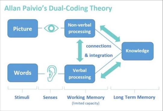
Research on Interactive Video Among Biology Students
The use of video as a self-paced e-learning medium has become standard practice in corporate training programs and higher education.
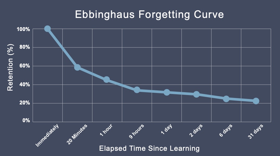
The Science Behind Why Microlearning Works
A single long training day often fails because it fights how the brain actually works — see how microlearning, the Forgetting Curve, and spaced repetition make material actually stick.
How AI Video Search Is Transforming Corporate L&D
Thousands of hours of training video pile up in your company's LMS, hard to search once a program ends — see how AI Video Search is changing the way L&D teams find specific moments buried in that dark data.
Want the short version, applied to your company?
Let's talk about what this means for you.
Get in touch